What is Material Design?
Google’s exciting Material Design has been a rapidly growing trend among the designers. It’s a visual design language created for Google’s new OS that synthesizes the classic principles of good design with the innovation and possibility of science and technology. Material design is a unified system that combines resources, theory and tools to craft immersive digital experiences.
Here are the nine principles on which Google has created its colorful Material Design interface.
Material is the metaphor: It provides a unifying theory of rationalized space and a system of motion. Flexibility of the material offers new affordances that supersede those of the physical world.
Surfaces are intuitive: Surfaces and edges offer the visual cues that define our experiences of reality. The use of familiar tactile attributes allows us to quickly understand affordances.
One adaptive design: A single underlying design system is important for organizing space and interactions. While each device provides a different view of the same underlying system, iconography, colors, spatial relationships and hierarchy remain unchanged.
Dimensional interactivity: Surface, light and movement are crucial for the interaction of objects. Realistic lighting fragments space, displays seams and indicates the movement of the parts.
Surface, color and iconography: Essence of experience design is user action. Their primary actions that serve as inflection points help transform the whole design. Their emphasis provides waypoint for the user and makes core functionality immediately accessible.
Content is bold and intentional: Visual elements like typography, scale, space, grids, imagery and color create hierarchy, meaning and focus. Edge-to-edge imagery, color choices and intentional white space create a bold and graphic interface that immerses the users in the experience.
Choreographed animation: All actions take place in a single environment. Even as the objects transform and reorganize, they are provided to the user without breaking the continuity.
Motion provides meaning: The whole design is transformed with the actions of primary user that initiate motion. Motion maintains continuity; transitions are efficient and coherent while feedback is subtle yet clear.
Users initiate change: User actions derive changes in the interface. Motion cascading from touch reinforces the user as the prime mover.
Material Environment
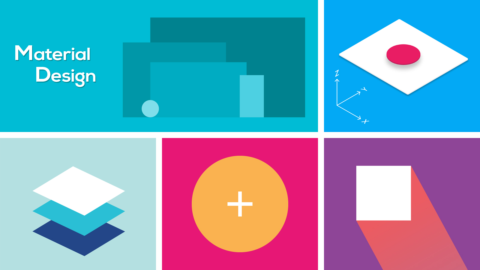
The material environment is made up of 3D space in which all objects have x, y and z dimensions. The z axis is aligned perpendicular to the plane of the display. Z-axis is used for the purpose of layering on the web, and not for perspective. By manipulating the y axis, 3D world can be emulated.
The three-dimensional environment of material design consists of material, light and cast shadows. While all material objects have x, y and z dimensions, they have single z axis position. Shadows are created due to the difference in elevation of the overlapping material. Ambient light creates soft shadows, key light creates directional shadows while virtual light illuminates the scene. In Android development, shadow is created when the source of light is blocked by the sheets of material at different positions along the z axis.
Usability and Accessibility
Accessibility design makes it possible for the users of varying capabilities to understand, navigate and use the UI in an easy way. The built in accessibility of the material design helps accommodate the users of all abilities, including those having cognitive impairments, low vision or blindness, and hearing impairments.
The app’s UI should be simplified with:
- Adequate contrast and size
- Clearly visible elements
- Easy navigation, and
- Clear hierarchy of importance.
Accessible color palette, contrast ratios, sound and motion, timed control, style, layout, hierarchy and focus are the other key accessibility elements that require due consideration There should be support for assistive technology to improve and maintain the functional capabilities of the individuals with disabilities.
Bi-directionality
User interfaces for RTL languages (those read from right to left) such as Arabic and Hebrew should be mirrored for easy understanding. When a UI is mirrored Left to Right (LTR) or Right to Left (RTL), following changes occur.
- Icons with text field are displayed on the opposite side of a field.
- Text translated to an RTL language is aligned to the right.
- Arrows of the icons that communicate direction are mirrored.
- Navigation buttons are displayed in reverse order.
Why Material Design?
Application design is responsible for the first impressions of the user and helps in determining whether or not a particular application will be chosen over others. On the other hand, Material Design defines the way an app should look like and behave. It is one of the most influential visual philosophies in design. Due to its clear design and usability, material design is shaping the way people view and interact with the interfaces. Nevertheless, material design goes beyond the Android and Google apps. Designers are using this philosophy in multiple ways, especially for layered interfaces.


 Deepak


